Archive for October 2011

Graphic Design Investigation (Task 3)

After researching Children's books, I chose to change my focus and look into advertising on transport. There are many different types of transport, all of which contain different ways to advertise and different forms of advertising. Here are a few examples;


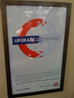
Advertisements are often found on many different types of transport. This can include, trams, underground subways, buses, taxis, trains planes etc. Here I have selected and photographed images from just a few of these different types. 


Buses and their related infrastructure are a commonly used form of advertisement. They are used by advertisers to visually communicate a message. Usually in the form of public campaign messages and promoting commercial brands. Buses are also regularly used as part of a promotional or political campaign or also as a tool in a commercial enterprise. Other forms of advertising are shown about, one of my personal favourites is the 'IRN-BRU' advert, digitally wrapped onto the outer body of a taxi this looks really effective and stands out well appealing to a wide audience and communicating a clear message.

Wednesday 26 October 2011 by Lisa Collier
Categories: | Leave a comment

Tutorial (24/10/11)

During reading week, we each had individual progress tutorials with Amber to assess how we are getting on and our current progress so far. Here is a list of things I hope to complete or improve over the next couple of weeks on the course;


- maintain 100% attendance
- develop briefs further (create words out of 'alphabet soup typeface' brief)
- keep blog up to date at all times, and remember to make detailed comments about briefs. 
- blog lecture notes with accompanying images
- link design practice blog more heavily to design context blog

by Lisa Collier
Categories: , , , | Leave a comment

Graphic Design Investigation (Task 3)

I decided to research further into Children's book covers, and how the images and illustrations are used to interact and educate young children. Here are some images I researched looking at how Children's book covers often include bright and vibrant colours which draw attention to the image and type, they also often have simple or bold text in a large format which is easy to read and understand for a younger audience;


All the images above are well known and famous Children's books that have been in production for many years.

Below is a Children's book cover that I previously designed for my own Colouring book which was produced and bound last year. Here are some images, this shows how I tried to incorporate 'typical' children's book elements, with bright colourful imagery and simple typography.


Here are some images of me and my cousin reading some children's books;

[Me and Kyle]


Many Graphic illustrators specialise in Children's books, and children's animation. Here are a select few; 

Alexandra Ball


Simple designs by Alexandra Ball above show her illustrative approach to represent child like comic designs.

Tim Bradford


Tim Bradford has a simple and detailed illustrative design focus which along with pastel tones gives a calm and peaceful feel to his work.

Hannah Davies


Again, Hannah Davies has a very different approach yet still very 'characterised' and focused heavily on a younger audience like children. I really like her working style, it has an essence of fun, happiness and enjoyment.
Joel went on to do some further research into Children's book covers, whilst I then developed my understanding of  advertisements on transport. Here are his findings;


Illustration seems to dominate the genre which I guess is to be expected. Sometimes it seems to even imitate the haphazard style of actual children's drawings and the blissful innocence that comes with that. We also see the use of vibrant colour to attract kids in. They are very much designed to play with the vivid imagination that children possess.


I was pleasantly surprised to find books with a heavy focus on typography as oppose to image mixed in between the barrage of illustrative examples. However they still focus on creating that hand drawn look. This seems to be a prevalent concern within the industry.


I find this 'Moomin' book interesting. It plays on that illustrative lure that the previous examples use but combines it with a modern graphic edge using gothic type. 


Thursday 20 October 2011 by Lisa Collier
Categories: | Leave a comment

Graphic Design Investigation (Task 3)

To complete our group task, we were each allocated different tasks. Josh Douglas decided to research road signs, and photographed every road sign that he passed on his journey from Morrison's (in Leeds) home to his Student accommodation. Here are some of the images he research for Graphic Design on Road Signs;


These images show the variety of road signs and Graphic symbols that we interact with each and every day and also shows how we communicate and translate their meaning with reading visual language as such. These symbols will be understood by countries all around the world, and that is the beauty of visual communication through image and type. The most powerful thing that stands out is the shapes and colours. For example; RED is a warning etc.


Triangular signs
Triangular signs are used as warnings - junctions ahead, road conditions, hazards ahead and so on. A black symbol appears on a white equilateral triangle (pointing upwards) with a thick red border. The usual warning that a road does not have priority at a junction reads "Give Way" and is an inverted triangle. 

Circular signs
Sometimes referred to as "roundels", circular signs give orders. White circles with thick red borders and black symbols give negative instructions - things you must NOT do. Blue circles with thin white borders and white symbols give positive instructions - things you MUST do.

Rectangular signs
Written information is relayed using rectangular signs. These come in many different colours and sizes.

What font is used?
There are two alphabets used on all road signs, which are "Transport Medium" and "Transport Heavy". These are differently weighted versions of the same typeface; "Transport Medium" has a thinner stroke width and is used for light text on a dark background, while "Transport Heavy" has a thicker stroke width and is used for dark text on light backgrounds. Both were adapted from an existing typeface by graphic artist Jock Kinneir in the early 1960s.
Kinneir actually designed a third typeface to complete the set, called Transport Light, which was intended for use on internally lit signs. It was never adopted.


How does the colour coding work?
Directional signs on different classes of road use different background colours to allow motorists to easily tell between different types of road and information.

Blue signs
Blue signs with white text and white borders are found on motorways, where all direction signing uses this colour scheme.

On non-motorway roads, the same colour scheme is occasionally used for signs bearing miscellaneous written information (such as advance warnings of weight restrictions). They are also used for direction signs for pedestrians and cyclists (which are always accompanied by a pedestrian or cycle symbol).

Green signs
Primary A-roads use green-backed signs, with white borders and text, and route numbers highlighted in gold. Green signs with white text but yellow borders are occasionally seen marking emergency services access points to places like airports and stadiums.

White signs
Signs with a white background are used on non-primary roads, with black text and black borders. Until 1994 there was an additional set that used black text and blue borders for 'local' directions, but these are now being phased out.

White signs also exist with other colour combinations. Those with black text and red borders, for example, are used for directions to Ministry of Defence sites.

Devonshire County Council has a unique system to signpost its minor routes. White signs with no border and all-capitals black text indicate the most minor routes suitable for local traffic; white signs with brown borders and mixed-case black text indicate roads suitable for light traffic; white signs with blue borders and mixed-case black text (the same as those phased out elsewhere since 1994) indicate roads suitable for general traffic.

Yellow signs
Temporary signs, such as diversion routes or direction signs through roadworks, have black text on a yellow background. Recently black-on-yellow signs have been erected in a small number of locations on motorways to draw attention to unusual junction layouts, but this is not standard practice and technically is not permitted. 

Brown signs
Tourist attractions are signed using brown-backed signs with white text and borders. Most also include a small pictogram to represent the attraction (a silhouette of an elephant for directions to a zoo, or of a football for directions to a stadium, for example).

Black signs
Directions for Heavy Goods Vehicles (HGVs) appear in white on black, usually with a pictogram of a lorry to make clear who the sign applies to.

by Lisa Collier
Categories: | Leave a comment

Graphic Design Investigation (Task 3)

5 x Categories of Graphic Design [investigate/ research]
  • road signs in Leeds City Centre (information graphics)
  • adverts on transport (advertising graphics)
  • instruction manuals for building furniture 
  • children’s books (entertainment graphics) 
  • food packaging on ready meals (information/ instruction graphics)
5 x Forms of Evidence  [to be documented on our blogs]
  • photographs - primary/secondary
  • books (referencing - scanning in)
  • collecting objects/ leaflets/ flyers
  • internet articles (sourced)
  • video/ filming
5 x Examples of Criteria for the Evaluation of “Good” Research [comment/ feedback]
  • relevance to category
  • reliability of source (primary/secondary)
  • Quality/Detail of research
  • Standard of Photographs (resolution/focused etc.)
  • quantity - a good range of varied research

Monday 3 October 2011 by Lisa Collier
Categories: | Leave a comment